Psychological Effects with Color Connections
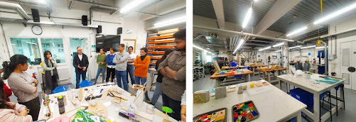
This is our third week of the class blog. Color Workshop was the name of this session, whose name is Psychological Effects with Color Connections. Color is a powerful element for understanding people's thoughts or representing cultural action. Firstly, we did the various type of paint on A1 sheet paper, which is yellow, green, black, red, blue, purple, sky, grey, orange, etc.

I love color, but the main focus is on my favorites, black, yellow, and blue. Black's psychological meaning is symbolic of mystery, power, and bold elegance. Color meanings can also be emotional, such as sadness or anger. Many people like this color because it is also popular. With a combination of yellow colors, interior spaces are focused on a specific wall side or ceiling.
This color's psychological meaning includes happiness, friendship, hope, and creativity. The meaning of the color blue is one of trust, responsibility, honesty, and loyalty. And blue represents wisdom and depth of knowledge.
Color Combination Work 01 _ Concept Diagram
This is our second piece, and the concept is welcome from the outside to the inside, from the ceiling to the ground. It does represent the celebration. Naturally, outside light gives the interior space the benefit of brightness. It helps create living interior spaces. Different materials give meaning to interior spaces. In that case, it can help if we use natural light to match colors or elements. This piece of furniture is abstract art in our interior spaces; in that case, it is one of the dominating objects of sculpture. The requirement for a ground connection is the foundation of major interior design for spaces.
This is our third work, and its concept was "Photo Frame." A photo frame is a protective border for a picture. It makes displaying the work easier and, besides, aesthetically integrates with the interior space. The frame, like a canvas, represents the memorable story. This work reminds me of a time we had lots of fun with our classmates. Actually, the frame's inner photo has lots of memory work.
A good illustration of how to use the elements of photo framing to tell a memorable tale is The Frame. For better artwork presentation and to enhance the interior space, it makes use of apertures created by entrances, arches, and windows. The idea picture frame is an essential component of art and is utilized by a variety of disciplines to reconfigure distinctions between painting and sculpture, art and life, or spiritual and secular space. In order to highlight the subject of a picture, it is frequently employed in photography.


A good description of the colour session. How does the colour perform in the frame? with the space and in relationship to the windows. How do you feel about the colours you worked with? How do they act on the body? Is the top image yours?
ReplyDelete